Adding toggle plus and minus
signs to a pure CSS accordion
For starters, I just want to make sure you know that this is a follow up from my last post how to create a simple and pure CSS accordion without JavaScript.
If you want to fully understand this blog post, I will recommend you to first visit that blog where I showed how to build that initial accordion.
Link is here: CSS Accordion No JS.
Also and before continue, you can also check this pure CSS accordion collection to get more inspiration.
Now if you already read the blog post before this one and you are ready, then let's begin.
Don't waste your time
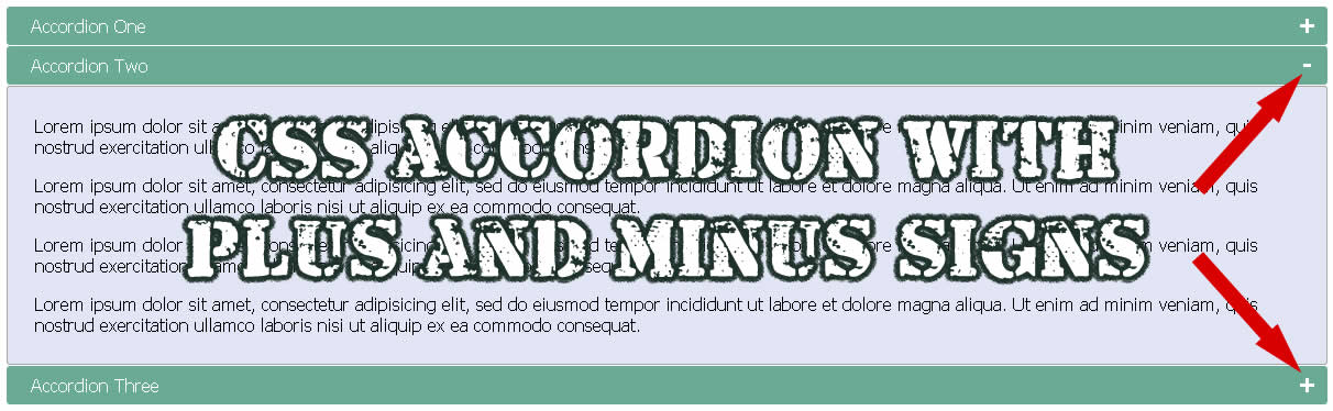
Now as I always do, please check the demo below so you are 100% sure this is what you want and need.
DEMO: Accordion with (+) and (-) signs
If this is what you want, then you can proceed.
If not, the please don't forget that at then you will find more related tutorials.
Got it?
Good.
Keep in mind that the option I will be giving you here can be used with any HTML markup, you just need to use a little imagination and make some testings to make sure it works with your code.
The last CSS accordion
On the last blog we created this HTML markup.
<input type="checkbox" id="title1" />
<label for="title1">Accordion One</label>

<div class="content">
<p>Your content goes here.</p>
</div>
Sample #1
In there we used the label tag to create the titles of our accordions.
Adding plus and minus signs
If you want to add plus (+) and minus (-) signs inside the accordions and you want to still avoid JavaScript to keep your website code super fast, then in that case we will need to keep using pure CSS properties.
NOTE: Remember for you to add the signs, you just need to add CSS styles, nothing more and nothing less.
In this case and to accomplish this we will use the content property with the CSS pseudo-element after.
Like this:
label::after {
    content: '+';
}
Sample #2
What this CSS style will do to the "label" tag is to add a plus (+) sign just after the label title text.
In our example below, instead of having the title "Accordion One", we will end up having "Accordion One +".
Now don't get confused in here because the plus (+) sign will be inserted inside your code after you run it.
So this plus (+) sign won't be visible in your naked code, just in case you can't see it inside your source code.
<input type="checkbox" id="title1" />
<label for="title1">Accordion One</label>
Sample #3
Adding minus (-) sign
Our next step will be adding the minus (-) sign when the user clicks to open the accordion.
Right now and only until this point we are only displaying the plus (+) sign on both states, when the accordion is open and when the accordion is closed.
If you remember on our first blog CSS accordion we used the ":checked" selector to show the content of our accordion.
So in this case we will keep using the same selector to display the minus (-) sign when we show the content.
Our new CSS will look like this.
input:checked + label::after {
    content: '-';
}
Sample #4
What this CSS will do to our title is change the plus (+) to minus (-) sign when the user clicks on the accordion to show the content.
So instead of having "Accordion One +", we will have "Accordion One -" when the user clicks on the accordion.
CSS Styling the plus and minus signs
Finally, we will just add a couple CSS styles to give better format to the signs.
Look how I am adding the "position: absolute" to the "label::after".
This will let me to move the plus and minus signs with the "right" and "top" properties.
IMPORTANT: Now please notice this, the moment I add "position: absolute" to the "label::after", I will need to add "position: relative" to the label tag.
Like below.
label {
    position: relative;
}
Sample #5
Why?
Because if we don't, then the plus and minus signs will move outside and they might disappear totally.
This is something you learn when applying positions to parents and children with CSS, if you are a newbie don't worry you will get there.
So here it is, the full CSS styles for the new "label::after" when not checked and when checked.
label::after {
    content: '+';
    font-size: 22px;
    font-weight: bold;
    position: absolute;
    right: 10px;
    top: 2px;
}

input:checked + label::after {
    content: '-';
    right: 14px;
    top: 3px;
}
Sample #6
That's it simple
PLEASE: Remember this is a continuation of my last blog post.
In here I am just showing you how to add plus and minus signs to that previous work I did.
To understand this tutorial, please visit that first post where I showed you how to build the pure CSS accordion.
Full HTML and CSS Styles
But anyways, if you want to just see the full code see below or download the work at the end of this article.
By the way don't forget to notice inside the HTML markup below how I added the "position: relative" to the label tag.
<!doctype html>

<html>

<head>
<meta charset="utf-8">
<title>CSS Accordion</title>

<style>

input {
    display: none;
}

label {
    display: block;
    padding: 8px 22px;
    margin: 0 0 1px 0;
    cursor: pointer;
    background: #6AAB95;
    border-radius: 3px;
    color: #FFF;
    transition: ease .5s;
    position: relative; /* ADDING THIS IS REQUIRED */
}

label:hover {
    background: #4E8774;
}

label::after {
    content: '+';
    font-size: 22px;
    font-weight: bold;
    position: absolute;
    right: 10px;
    top: 2px;
}

input:checked + label::after {
    content: '-';
    right: 14px;
    top: 3px;
}

.content {
    background: #E2E5F6;
    padding: 10px 25px;
    border: 1px solid #A7A7A7;
    margin: 0 0 1px 0;
    border-radius: 3px;
}

input + label + .content {
    display: none;
}

input:checked + label + .content {
    display: block;
}

</style>

</head>

<body>

<input type="checkbox" id="title1" />
<label for="title1">Accordion One</label>

<div class="content">
<p>Your content goes here.</p>
</div>

<input type="checkbox" id="title2" />
<label for="title2">Accordion Two</label>

<div class="content">
<p>Your content goes here.</p>
</div>

<input type="checkbox" id="title3" />
<label for="title3">Accordion Three</label>

<div class="content">
<p>Your content goes here.</p>
</div>

</body>

</html>
Sample #7
To download this work, please use the link below.
LINK:Download Code
Don't forget to send me your comments.
Get Inspired, see these 18 pure CSS accordions
Lorem ipsum dolor sit amet, consectetur adipiscing elit. Etiam bibendum, sem eu pulvinar blandit, et luctus tellus magna sed nibh.
Lorem ipsum dolor sit amet, consectetur adipiscing elit. Etiam bibendum, sem eu pulvinar blandit, et luctus tellus magna sed nibh.