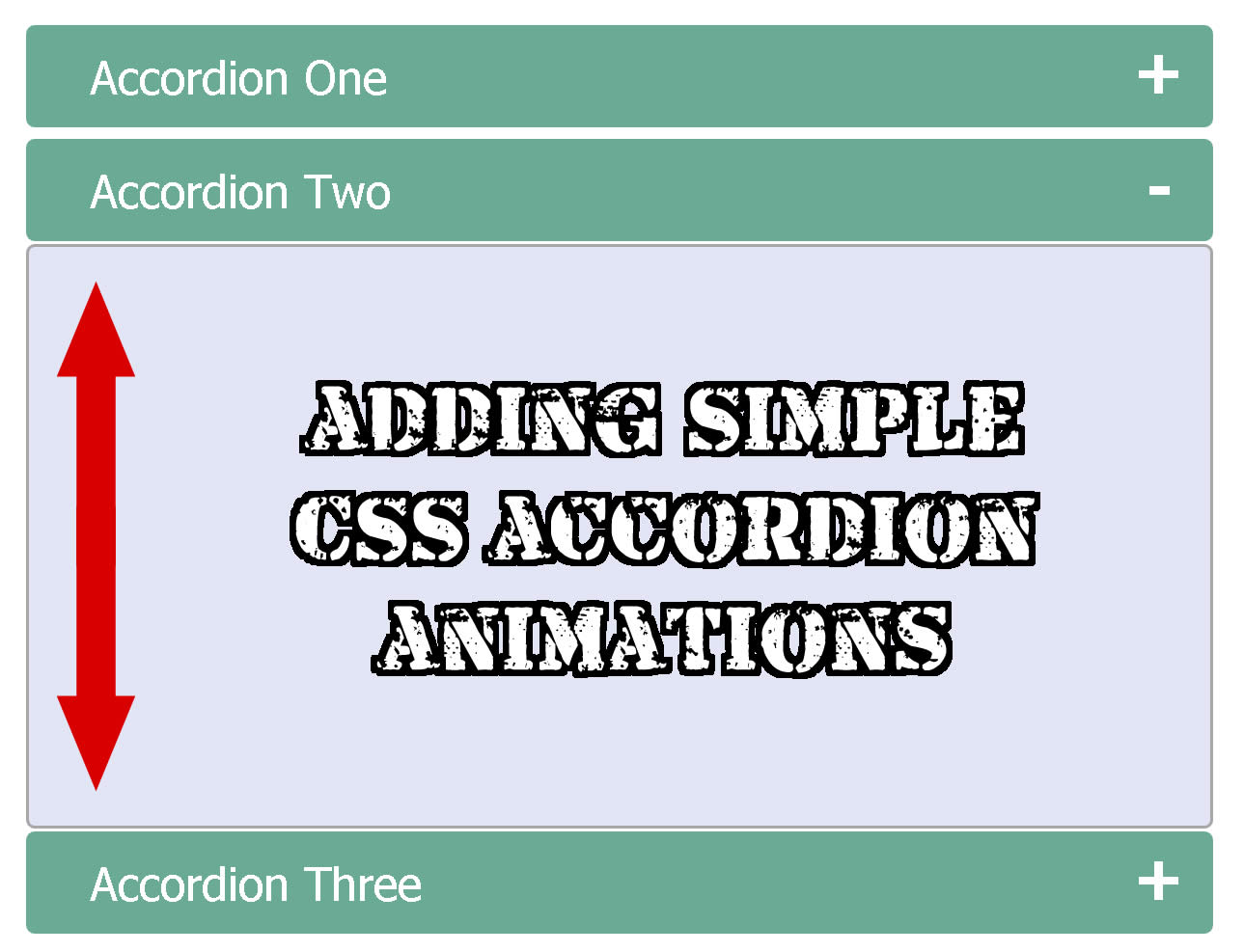
How to create a simple
CSS accordion animation
Creating a pure CSS accordion animation won't be as simple as you think but it is possible if we combine a couple of CSS properties together.
Keep in mind that in here and for you to save some time, you are going to be building on top of an accordion that I already built in the past.
So my recommendation before you even start this tutorial is to read this blog where I showed how to build an initial CSS accordion.
Oh and yes, what you will be doing here it can be used inside any code you want.
You will just need to test the code and perhaps modify it a bit to make it work everywhere.
Also make sure you check this pure CSS accordion collection to get more inspiration.
Don't waste your time
As I always do and recommend, please check the demo below
So you can make sure this is what you want and need.
DEMO: Simple CSS accordion animation
If this is what you want, then please proceed.
Remembering original CSS accordion
Let's start by remembering the full HTML accordion I built on the last blog post.
You can see the live demo here.
And the full HTML markup will be below.
<!doctype html>

<html>

<head>
<meta charset="utf-8">
<title>CSS Accordion</title>

<style>

input {
    display: none;
}

label {
    display: block;
    padding: 8px 22px;
    margin: 0 0 1px 0;
    cursor: pointer;
    background: #6AAB95;
    border-radius: 3px;
    color: #FFF;
    transition: ease .5s;
}

label:hover {
    background: #4E8774;
}

.content {
    background: #E2E5F6;
    padding: 10px 25px;
    border: 1px solid #A7A7A7;
    margin: 0 0 1px 0;
    border-radius: 3px;
}

input + label + .content {
    display: none;
}

input:checked + label + .content {
    display: block;
}

</style>

</head>

<body>

<input type="checkbox" id="title1" />
<label for="title1">Accordion One</label>

<div class="content">
<p>Your content goes here.</p>
</div>

<input type="checkbox" id="title2" />
<label for="title2">Accordion Two</label>

<div class="content">
<p>Your content goes here.</p>
</div>

<input type="checkbox" id="title3" />
<label for="title3">Accordion Three</label>

<div class="content">
<p>Your content goes here.</p>
</div>

</body>

</html>
Sample #1
Animating the content
Now keep in mind that what we are going to be animating in here is where the content is located.
If you see below, the main text will be wrapped inside a "div" tag with the class "content".
<div class="content">
<p>Your content goes here.</p>
</div>
Sample #2
This content will be hid and displayed by the CSS styles below.
input + label + .content {
    display: none;
}

input:checked + label + .content {
    display: block;
}
Sample #3
Changing display to opacity
Now because we are going to be using the "transition" property, we need to eliminate the CSS styles from above.
Why?
Because "transition" property won't work with the "display" properties.
So first we need to change the "display: none;" to "opacity: 0;"
And then change the "display: block;" to "opacity: 1;"
We will end up with this.
input + label + .content {
	opacity: 0;
}

input:checked + label + .content {
	opacity: 1;
}
Sample #4
Input tag and the checked property
Remember, then "input" tag together with the CSS property ":checked" are the main things in here doing the work for displaying and hiding the content.
When the "input" tag is not checked, the content is hid.
And when the "input" is checked the content will be displayed.
When content is hid
Now because the content is hidden, we need to change the font size and the height to zero.
input + label + .content {
	opacity: 0;
	height: 0;
	font-size: 0;
}
Sample #5
Why?
Well first is because the content is not showing.
When the content is hid there is no need for you to have any font size for the text or any height for the box containing the text.
And second is because when we apply the CSS "transition" property, we want to transition from zero font size and zero height to whatever font size and height we will be using in the final estate.
And in this case inside the final estate when the content is displaying.
When content is displayed
Next will be changing the font size and height when the content is showing.
Remember, the content will be showing when the user clicks on the input.
See below how we changed the font size and the height.
input:checked + label + .content {
	opacity: 0;
	height: 120px;
	font-size: 14px;
}
Sample #6
Transition and final CSS touches
Finally let's add the "transition" property and a couple paddings to style the final effects.
NOTE: Keep in mind that the "transition" property should be added only to the initial state and not the final state.
That's why you won't see the "transition" property when the input is using ":checked".
input + label + .content {
	opacity: 0;
	height: 0;
	font-size: 0;
	padding: 0 25px;
	transition: ease .5s;
}

input:checked + label + .content {
	opacity: 1;
	height: 120px;
	font-size: 14px;
	padding: 10px 25px;
}
Sample #7
Writing the height is important
A final note of advice is for you to keep an eye on the height.
The height will be always required and you will need to change the height size accordingly.
The height size should be in correlation to the amount of the content you have inside your accordion.
So please remember this as you will need to play with this number a lot.
If you have more paragraphs this number will increase.
If you have less paragraphs this number will decrease.
You finished
And that's if, we just finished.
If you want to download the demo please use the link below.
DEMO:Download
And if you want the full code just copy the text below.
Full final HTML code
<!doctype html>

<html>

<head>
<meta charset="utf-8">
<title>CSS Accordion</title>

<style>

input {
    display: none;
}

label {
    display: block;
    padding: 8px 22px;
    margin: 0 0 1px 0;
    cursor: pointer;
    background: #6AAB95;
    border-radius: 3px;
    color: #FFF;
    transition: ease .5s;
}

label:hover {
    background: #4E8774;
}

.content {
    background: #E2E5F6;
    padding: 10px 25px;
    border: 1px solid #A7A7A7;
    margin: 0 0 1px 0;
    border-radius: 3px;
}

input + label + .content {
	opacity: 0;
	height: 0;
	font-size: 0;
	padding: 0 25px;
	transition: ease .5s;
}

input:checked + label + .content {
	opacity: 1;
	height: 120px;
	font-size: 14px;
	padding: 10px 25px;
}

</style>

</head>

<body>

<input type="checkbox" id="title1" />
<label for="title1">Accordion One</label>

<div class="content">
<p>Your content goes here.</p>
</div>

<input type="checkbox" id="title2" />
<label for="title2">Accordion Two</label>

<div class="content">
<p>Your content goes here.</p>
</div>

<input type="checkbox" id="title3" />
<label for="title3">Accordion Three</label>

<div class="content">
<p>Your content goes here.</p>
</div>

</body>

</html>
Sample #8
If you have any questions, please don't hesitate in clicking the green button below.
And if you live near Fort Worth and need any kind of web design help, you can also call me or text me.
Just visit my home page and your will find all my information at the end.
Get Inspired, see these 18 pure CSS accordions
Lorem ipsum dolor sit amet, consectetur adipiscing elit. Etiam bibendum, sem eu pulvinar blandit, et luctus tellus magna sed nibh.
Lorem ipsum dolor sit amet, consectetur adipiscing elit. Etiam bibendum, sem eu pulvinar blandit, et luctus tellus magna sed nibh.